ASP.NET Core Blazor | DataGrid Cells

This is Part 28 of web development with Blazor video series. In this video we will discuss everything you need to know about cells in Blazor DataGrid.
HTML in Blazor DataGrid Cell
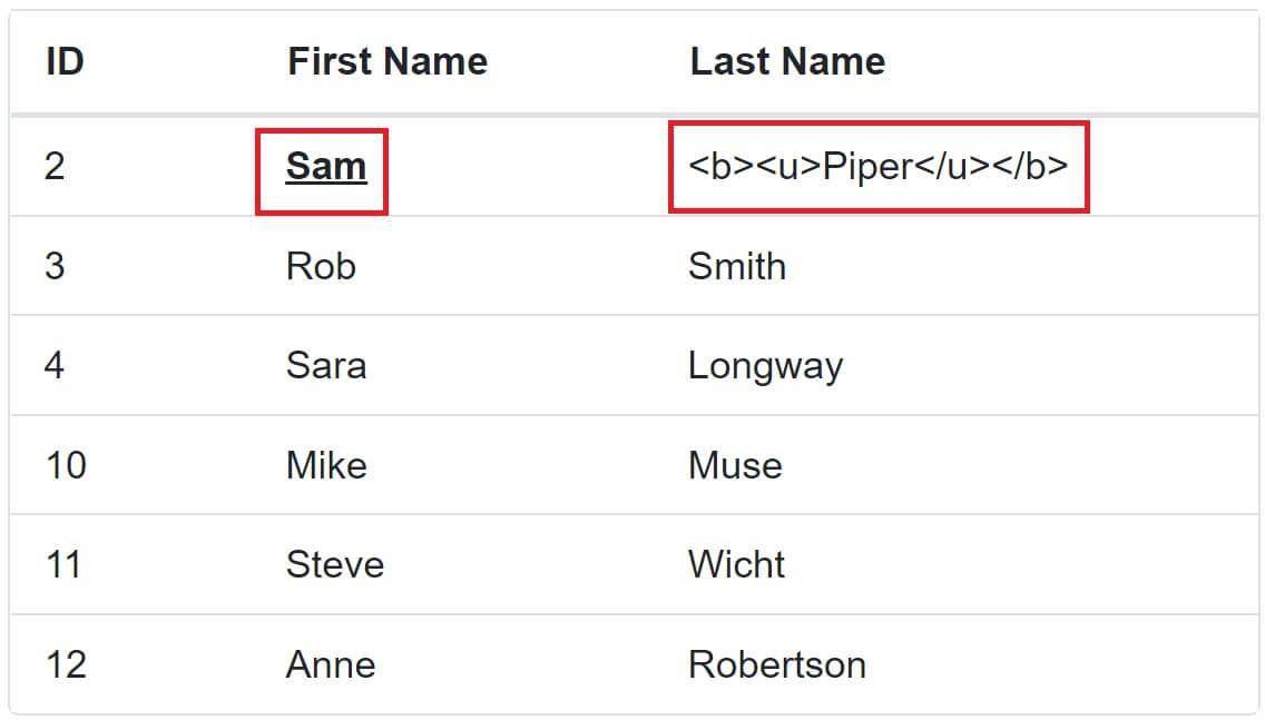
- By default the HTML tags are displayed as is by a Blazor DataGrid cell.
- For example,
<b>Sam</b>as is in the DataGrid cell. - If you want the HTML to be processed instead of displaying as is, then set
DisableHtmlEncode = falseon the respective<GridColumn>. - The default value is
true.
We have HTML both in FirstName and LastName coumns in the underlying database table
Update Employees set FirstName = '<b><u>Sam</u></b>' where EmployeeId in (2)
Update Employees set LastName = '<b><u>Piper</u></b>' where EmployeeId in (2)
In the example below, DisableHtmlEncode="false" on FirstName and DisableHtmlEncode="true" on LastName.
<SfGrid DataSource="@Employees" Width="450">
    <GridColumns>
        <GridColumn Field=@nameof(Employee.EmployeeId) IsPrimaryKey="true"
                    HeaderText="ID" Width="60"></GridColumn>
        <GridColumn Field=@nameof(Employee.FirstName) HeaderText="First Name" Width="100"
                    DisableHtmlEncode="false"></GridColumn>
        <GridColumn Field=@nameof(Employee.LastName) HeaderText="Last Name" Width="150"
                    DisableHtmlEncode="true"></GridColumn>
    </GridColumns>
</SfGrid>
The HTML in the FirstName column is processed, where as in the LastName column it is displayed as is.
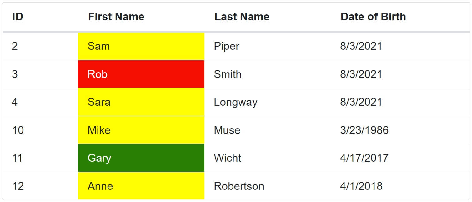
Apply styles to datagrid cells at runtime based on cell value
- Use
QueryCellInfoevent to apply styles to a datagrid cell based on it's value at runtime. - This event is triggered for every cell.
- The event handler, receives
QueryCellInfoEventArgswhich contains the details of the cell.
In the following example, if employee FirstName
- Starts with letter G, change the cell background color to Green
- Starts with letter R, change the cell background color to Red
- Starts with any other letter, change the cell background color to Yellow
@page "/"
@*@page "/datagridcells"*@
@using Syncfusion.Blazor.Grids
<SfGrid DataSource="@Employees" Width="600">
<GridEvents QueryCellInfo="QueryCellInfoHandler" TValue="Employee"></GridEvents>
<GridColumns>
<GridColumn Field=@nameof(Employee.EmployeeId) IsPrimaryKey="true"
HeaderText="ID" Width="60"></GridColumn>
<GridColumn Field=@nameof(Employee.FirstName) HeaderText="First Name"
Width="100" DisableHtmlEncode="false"></GridColumn>
<GridColumn Field=@nameof(Employee.LastName) HeaderText="Last Name"
Width="100" DisableHtmlEncode="true"></GridColumn>
<GridColumn Field=@nameof(Employee.DateOfBrith) HeaderText="Date of Birth"
Width="110"></GridColumn>
</GridColumns>
</SfGrid>
@code{
public List<Employee> Employees { get; set; }
[Inject]
public IEmployeeService EmployeeService { get; set; }
protected override async Task OnInitializedAsync()
{
Employees = (await EmployeeService.GetAllEmployees()).ToList();
}
private void QueryCellInfoHandler(QueryCellInfoEventArgs<Employee> args)
{
if (args.Column.Field == "FirstName")
{
if (args.Data.FirstName.StartsWith("G"))
{
args.Cell.AddStyle(new string[] { "background-color:green; color:white;" });
}
else if (args.Data.FirstName.StartsWith("R"))
{
args.Cell.AddStyle(new string[] { "background-color:red; color:white;" });
}
else
{
args.Cell.AddStyle(new string[] { "background-color:yellow;" });
}
}
}
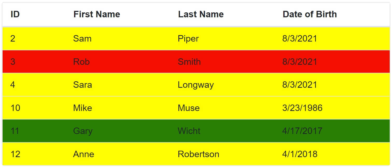
}Apply styles to datagrid rows at runtime based on column value
- Use
RowDataBoundevent to apply styles to a datagrid row based on a specific column value at runtime. - This event is triggered for every row in the DataGrid.
- The event handler, receives
RowDataBoundEventArgswhich contains the details of the row.
In the following example, if employee FirstName
- Starts with letter G, change the row background color to Green
- Starts with letter R, change the row background color to Red
- Starts with any other letter, change row background color to Yellow
@page "/"
@*@page "/datagridcells"*@
@using Syncfusion.Blazor.Grids

<SfGrid DataSource="@Employees" Width="600">
    <GridEvents RowDataBound="RowBound" TValue="Employee"></GridEvents>
    <GridColumns>
        <GridColumn Field=@nameof(Employee.EmployeeId) IsPrimaryKey="true"
                    HeaderText="ID" Width="60"></GridColumn>
        <GridColumn Field=@nameof(Employee.FirstName) HeaderText="First Name"
                    Width="100" DisableHtmlEncode="false"></GridColumn>
        <GridColumn Field=@nameof(Employee.LastName) HeaderText="Last Name"
                    Width="100" DisableHtmlEncode="true"></GridColumn>
        <GridColumn Field=@nameof(Employee.DateOfBrith) HeaderText="Date of Birth"
                    Width="110"></GridColumn>
    </GridColumns>
</SfGrid>

@code{

    public List<Employee> Employees { get; set; }

    [Inject]
    public IEmployeeService EmployeeService { get; set; }

    protected override async Task OnInitializedAsync()
    {
        Employees = (await EmployeeService.GetAllEmployees()).ToList();
    }

    private void RowBound(RowDataBoundEventArgs<Employee> args)
    {
        if (args.Data.FirstName.StartsWith("G"))
        {
            args.Row.AddStyle(new string[] { "background-color:green; color:white;" });
        }
        else if (args.Data.FirstName.StartsWith("R"))
        {
            args.Row.AddStyle(new string[] { "background-color:red; color:white;" });
        }
        else
        {
            args.Row.AddStyle(new string[] { "background-color:yellow;" });
        }
    }
}
QueryCellInfo Vs RowDataBound
- To Apply styles to a cell, we handle QueryCellInfo event, similarly, to apply styles to a row, we handle RowDataBound event.
- QueryCellInfo event is triggered for every cell in the DataGrid where as RowDataBound on the other hand is triggered for every row in the DataGrid.
- For QueryCellInfo event, the event pay load is QueryCellInfoEventArgs and for RowDataBound event it is RowDataBoundEventArgs.
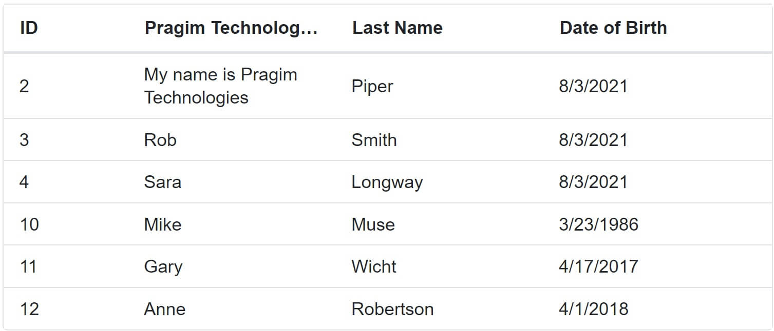
Wrap Blazor DataGrid column value
- To wrap column value set
AllowTextWrapproperty to true. - By default, both header and column values are wrapped.
- Use
<GridTextWrapSettings>component to configure wrap mode.
WrapMode can be
- Both: Default. Both header and column content are wrapped.
- Header: Only header content is wrapped.
- Content: Only column content is wrapped.
In the following example, WrapMode is set to "WrapMode.Content", so only the column content is wrapped but not header content.
<SfGrid DataSource="@Employees" Width="600" AllowTextWrap="true">
    <GridTextWrapSettings WrapMode="WrapMode.Content"></GridTextWrapSettings>
    <GridColumns>
        <GridColumn Field=@nameof(Employee.EmployeeId) IsPrimaryKey="true"
                    HeaderText="ID" Width="60"></GridColumn>
        <GridColumn Field=@nameof(Employee.FirstName) HeaderText="Pragim Technologies First Name"
                    Width="100" DisableHtmlEncode="false"></GridColumn>
        <GridColumn Field=@nameof(Employee.LastName) HeaderText="Last Name"
                    Width="100" DisableHtmlEncode="true"></GridColumn>
        <GridColumn Field=@nameof(Employee.DateOfBrith) HeaderText="Date of Birth"
                    Width="110"></GridColumn>
    </GridColumns>
</SfGrid>
Blazor DataGrid Lines
Use GridLines property to configure DataGrid Lines. The value is GridLine enum with the following 5 options.
- Default - Displays DataGrid lines based on the theme.
- Both - Displays both the horizontal and vertical DataGrid lines.
- None - No DataGrid lines are displayed.
- Horizontal - Displays the horizontal DataGrid lines only.
- Vertical - Displays the vertical DataGrid lines only.
<SfGrid DataSource="@Employees" Width="600" GridLines="GridLine.Both">
<GridColumns>
<GridColumn Field=@nameof(Employee.EmployeeId) IsPrimaryKey="true"
HeaderText="ID" Width="60"></GridColumn>
<GridColumn Field=@nameof(Employee.FirstName) HeaderText="First Name"
Width="100" DisableHtmlEncode="false"></GridColumn>
<GridColumn Field=@nameof(Employee.LastName) HeaderText="Last Name"
Width="100" DisableHtmlEncode="true"></GridColumn>
<GridColumn Field=@nameof(Employee.DateOfBrith) HeaderText="Date of Birth"
Width="110"></GridColumn>
</GridColumns>
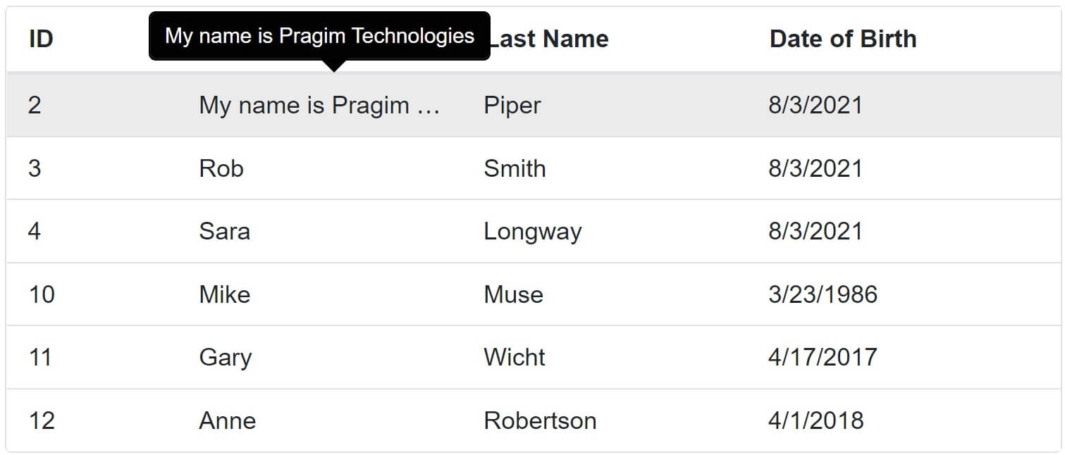
</SfGrid>Blazor DataGrid Clip Mode
ClipModeproperty of a DataGrid column allows us to control the display of cell content when it overflows.- This property is set on
<GridColumn>component.
The value is ClipMode enum with the following 3 options.
- Clip: Truncates the cell content when it overflows.
- Ellipsis: Displays ellipsis when the cell content overflows.
- EllipsisWithTooltip: Displays ellipsis along with a tooltip when the cell content overflows. The tooltip is displayed upon hovering the mouse over the respective cell.
<SfGrid DataSource="@Employees" Width="600" AllowTextWrap="true" ClipMode="ClipMode.EllipsisWithTooltip">
    <GridTextWrapSettings WrapMode="WrapMode.Content"></GridTextWrapSettings>
    <GridColumns>
        <GridColumn Field=@nameof(Employee.EmployeeId) IsPrimaryKey="true"
                    HeaderText="ID" Width="60"></GridColumn>
        <GridColumn Field=@nameof(Employee.FirstName) HeaderText="Pragim Technologies First Name"
                    Width="100" DisableHtmlEncode="false"></GridColumn>
        <GridColumn Field=@nameof(Employee.LastName) HeaderText="Last Name"
                    Width="100" DisableHtmlEncode="true"></GridColumn>
        <GridColumn Field=@nameof(Employee.DateOfBrith) HeaderText="Date of Birth"
                    Width="110"></GridColumn>
    </GridColumns>
</SfGrid>
ClipMode is set to EllipsisWithTooltip, so upon hovering the mouse over the respective cell, the tooltip is displayed.


© 2020 Pragimtech. All Rights Reserved.