Display loading indicator in blazor
In this video we will discuss how to display a loading indicator, if there is a delay in retrieving the data a blazor component needs. You can see the loading spinner in action below.
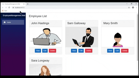
Employee List Component
A component like EmployeeList component retrieves data from a server asynchronously. Employees property in the base class holds the list of employees. We typically retrieve employees from a database by calling a server side service which is an asynchronous operation. By the time the component is rendered, this asynchronous operation might not have completed. This means Employees property could be null and can result in NullReference exceptions.
// EmployeeListBase.cs
public class EmployeeListBase : ComponentBase
{
public IEnumerable<Employee> Employees { get; set; }
protected override async Task OnInitializedAsync()
{
await Task.Run(LoadEmployees);
}
private void LoadEmployees()
{
System.Threading.Thread.Sleep(2000);
// Retrieve data from the server and initialize
// Employees property which the View will bind
}
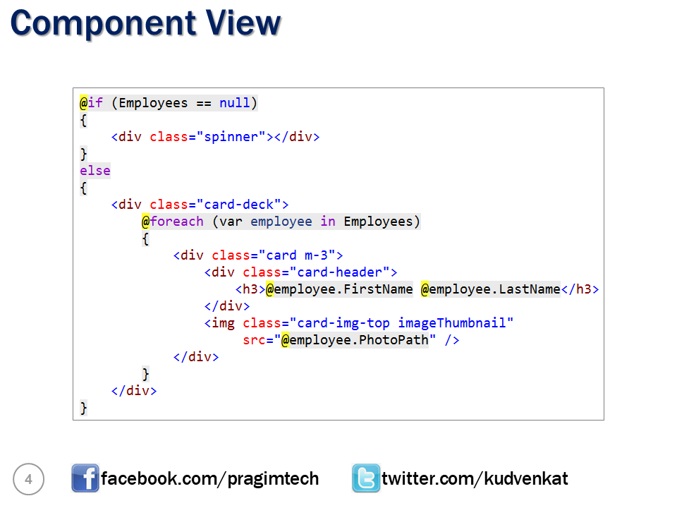
}While Employees property is null we see the loading spinner. As soon as the asynchronous operation is complete and Employees property is populated we see the list of Employees.
// EmployeeList.razor
@if (Employees == null)
{
<div class="spinner"></div>
}
else
{
<div class="card-deck">
@foreach (var employee in Employees)
{
<div class="card m-3">
<div class="card-header">
<h3>@employee.FirstName @employee.LastName</h3>
</div>
<img class="card-img-top imageThumbnail"
src="@employee.PhotoPath" />
</div>
}
</div>
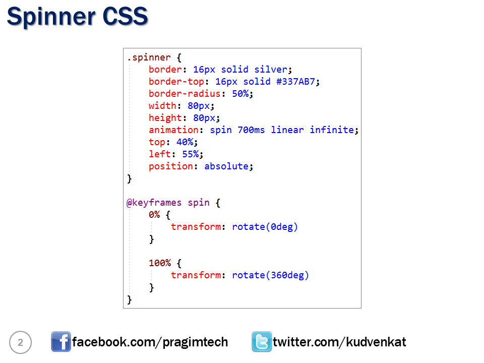
}We are using CSS animations to get the effect of a loading spinner. Place the following CSS in wwwroot/css/site.css file. To match the look and feel of the spinner with your application pages, you can change the css properties accordingly in the spinner class.
For example to change the spinner color to Red, set border-top property to 16px solid red.
.spinner {
    border: 16px solid silver;
    border-top: 16px solid #337AB7;
    border-radius: 50%;
    width: 80px;
    height: 80px;
    animation: spin 700ms linear infinite;
    top: 40%;
    left: 55%;
    position: absolute;
}

@keyframes spin {
    0% {
        transform: rotate(0deg)
    }

    100% {
        transform: rotate(360deg)
    }
}
Slides


© 2020 Pragimtech. All Rights Reserved.