ASP.NET Core Blazor | Grouping Data

This is Part 13 of Web development with Blazor series. In this article we will discuss grouping data.
Enable Grouping in Blazor DataGrid
- To enable grouping, set
AllowGrouping = "true". - To group rows in the grid simply drag and drop the column header in the group drop area.
- With grouping applied, datagrid records are organized into a hierarchical structure which can then be easily collapsed and expanded.
- To disable grouping by a specific column, set
AllowGrouping="false"on the respective<GridColumn>. - In the example below, Grouping by
LastNamecolumn is disabled.
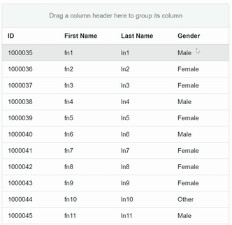
@page "/all"

@if (Employees == null)
{
    <h3>Loading Data...</h3>
}
else
{
    <h3>All Employees</h3>
    <SfGrid DataSource="@Employees" AllowGrouping="true">
        <GridColumns>
            <GridColumn Field=@nameof(Employee.EmployeeId) HeaderText="ID"></GridColumn>
            <GridColumn Field=@nameof(Employee.FirstName) HeaderText="First Name"></GridColumn>
            <GridColumn AllowGrouping="false" Field=@nameof(Employee.LastName) HeaderText=" Last Name"></GridColumn>
            <GridColumn Field=@nameof(Employee.Gender) HeaderText="Gender"></GridColumn>
        </GridColumns>
    </SfGrid>
}

@code {
    public List<Employee> Employees { get; set; }

    [Inject]
    public IEmployeeService EmployeeService { get; set; }

    protected override async Task OnInitializedAsync()
    {
        Employees = (await EmployeeService.GetAllEmployees()).ToList();
    }
}
Group Settings
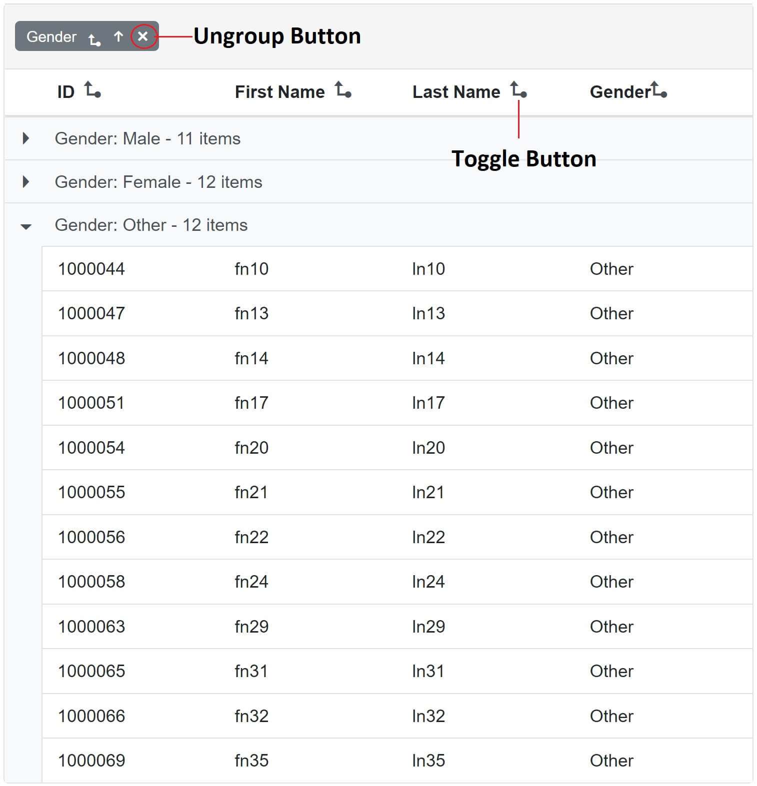
- To configure or customise group settings use
<GridGroupSettings>component. - To display group and ungroup toggle button set
ShowToggleButton="true". - To display ungroup button (X) set
ShowUngroupButton="true". - For numeric and datetime columns, to enable or disable grouping by the format string use
EnableGroupByFormatboolean property. - When data is grouped by a specific column, that column is not displayed in the DataGrid.
- Set
ShowGroupedColumn="true"to display the grouped column in the datagrid. - In the following example, data rows are grouped by
Gendercolumn and we also see the Gender column in the DataGrid.
<SfGrid DataSource="@Employees" AllowGrouping="true">
    <GridGroupSettings ShowGroupedColumn="true" ShowUngroupButton="true" ShowToggleButton="true">
    </GridGroupSettings>
    <GridColumns>
        <GridColumn Field=@nameof(Employee.EmployeeId) HeaderText="ID"></GridColumn>
        <GridColumn Field=@nameof(Employee.FirstName) HeaderText="First Name"></GridColumn>
        <GridColumn Field=@nameof(Employee.LastName) HeaderText=" Last Name"></GridColumn>
        <GridColumn Field=@nameof(Employee.Gender) HeaderText="Gender"></GridColumn>
    </GridColumns>
</SfGrid>
Group Caption
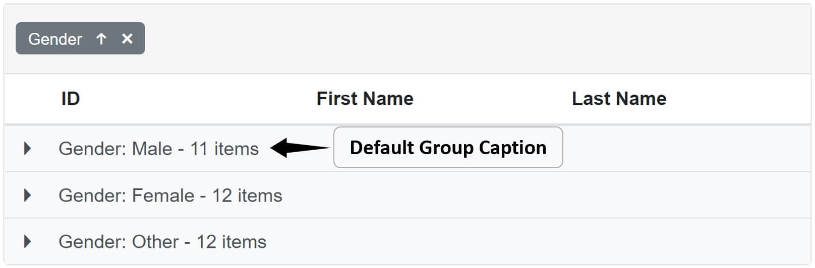
The default group caption is shown below.
Use <CaptionTemplate> componentto customise the group caption as shown below.
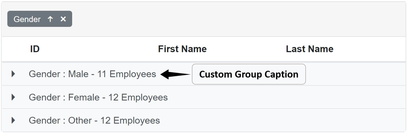
<SfGrid DataSource="@Employees" AllowGrouping="true">
    <GridGroupSettings>
        <CaptionTemplate>
            @{
                var employee = (context as CaptionTemplateContext);
                <div>@employee.Field : @employee.Key - @employee.Count Employees</div>
            }
        </CaptionTemplate>
    </GridGroupSettings>
    <GridColumns>
        <GridColumn Field=@nameof(Employee.EmployeeId) HeaderText="ID"></GridColumn>
        <GridColumn Field=@nameof(Employee.FirstName) HeaderText="First Name"></GridColumn>
        <GridColumn Field=@nameof(Employee.LastName) HeaderText=" Last Name"></GridColumn>
        <GridColumn Field=@nameof(Employee.Gender) HeaderText="Gender"></GridColumn>
    </GridColumns>
</SfGrid>
Initial Group
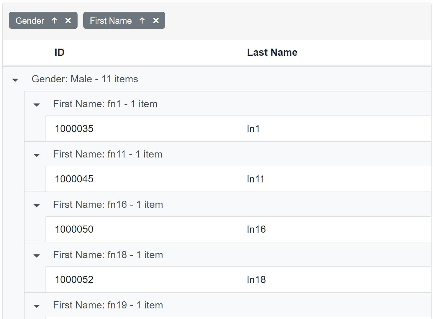
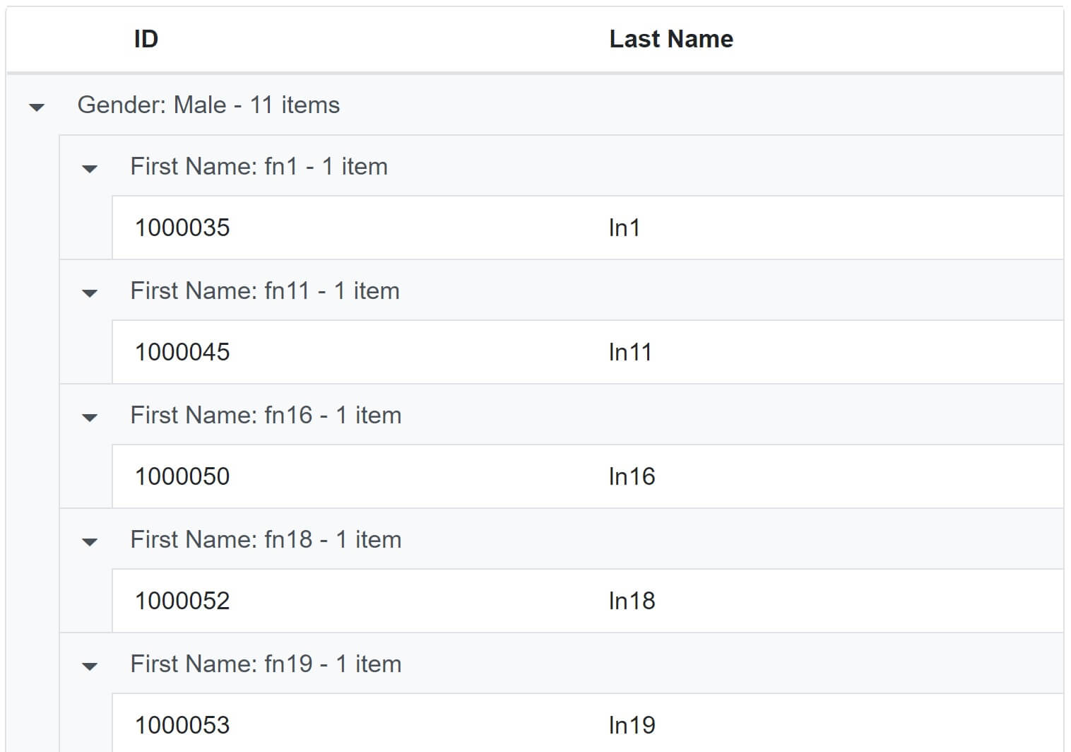
To have the data grouped by one or more fields on the initial grid load, use Columns property of <GridGroupSettings> component.
@{
    var intialGrouping = (new string[] { "Gender", "FirstName" });
}

<SfGrid DataSource="@Employees" AllowGrouping="true">
    <GridGroupSettings Columns="@intialGrouping">
    </GridGroupSettings>
    <GridColumns>
        <GridColumn Field=@nameof(Employee.EmployeeId) HeaderText="ID"></GridColumn>
        <GridColumn Field=@nameof(Employee.FirstName) HeaderText="First Name"></GridColumn>
        <GridColumn Field=@nameof(Employee.LastName) HeaderText=" Last Name"></GridColumn>
        <GridColumn Field=@nameof(Employee.Gender) HeaderText="Gender"></GridColumn>
    </GridColumns>
</SfGrid>
When the grid first loads, the data is grouped by Gender and FirstName columns.
To avoid ungrouping or further grouping of a column after initial column grouping, set ShowDropArea="false".
<SfGrid DataSource="@Employees" AllowGrouping="true">
    <GridGroupSettings Columns="@intialGrouping" ShowDropArea="false">
    </GridGroupSettings>
    <GridColumns>
        <GridColumn Field=@nameof(Employee.EmployeeId) HeaderText="ID"></GridColumn>
        <GridColumn Field=@nameof(Employee.FirstName) HeaderText="First Name"></GridColumn>
        <GridColumn Field=@nameof(Employee.LastName) HeaderText=" Last Name"></GridColumn>
        <GridColumn Field=@nameof(Employee.Gender) HeaderText="Gender"></GridColumn>
    </GridColumns>
</SfGrid>
Column drop area is hidden and the data cannot be ungrouped or grouped further.


© 2020 Pragimtech. All Rights Reserved.